My WORK
Case Study
Camp Jams
Live Collaborative Music App
Platform: iOS | Role: Lead UX Designer | Timeline: Concept → MVP
Methods: Qualitative research, synthesis, interaction design, usability testing
Problem: Friends spontaneously gather around a campfire to play music, but searching for lyrics and chords on phones disrupts the flow. Songs are often abandoned because the key isn’t right, and what should be a fun, social activity becomes frustrating work.
Solution: An iOS app that allows users to start live collaborative “Jams.” Lyrics and chords auto-scroll in real time, synchronized to the host’s performance, so everyone can play and sing together seamlessly.

Research
1. User Interviews
Conducted 8 semi-structured interviews with casual and experienced musicians.Key Insights
- Manual scrolling interrupts performance.
- Finding accurate lyrics and chord sheets is frustrating and time-consuming.
- There’s no easy way to change the song key to accommodate everyone’s vocal range.
2. Contextual Inquiry
Observed 3 groups jamming in real-world settings.Key Insights
- Frustration arises when searching for lyrics and chords mid-performance.
- Groups rely on a single device because different songs require different apps.
- Guitarists frequently stop playing to scroll, causing the group to go out of sync.
- There’s no way to save preferred song sheets for future sessions.
3. Competitive Analysis
Evaluated 2 music and collaboration apps - Ultimate Guitar and JamKazam - focusing on features, useability and performance.Key Insights
Ultimate Guitar- Optimize for solo practice, not group play.
- Manual scrolling is common and disruptive. Many different versions of songs (not always accurate).
- Joining group sessions requires excessive setup and account registration.
- Structured more for scheduled sessions with performers in different locations.
How This Informed Design
- Auto-scroll emerged as a key differentiator, directly improving usability during active sessions.
- Session codes replaced complex invitation flows, reducing friction for first-time users.
- Fast, hands-free search and saving favorite songs and jam sessions became a critical requirement.
Research Outputs
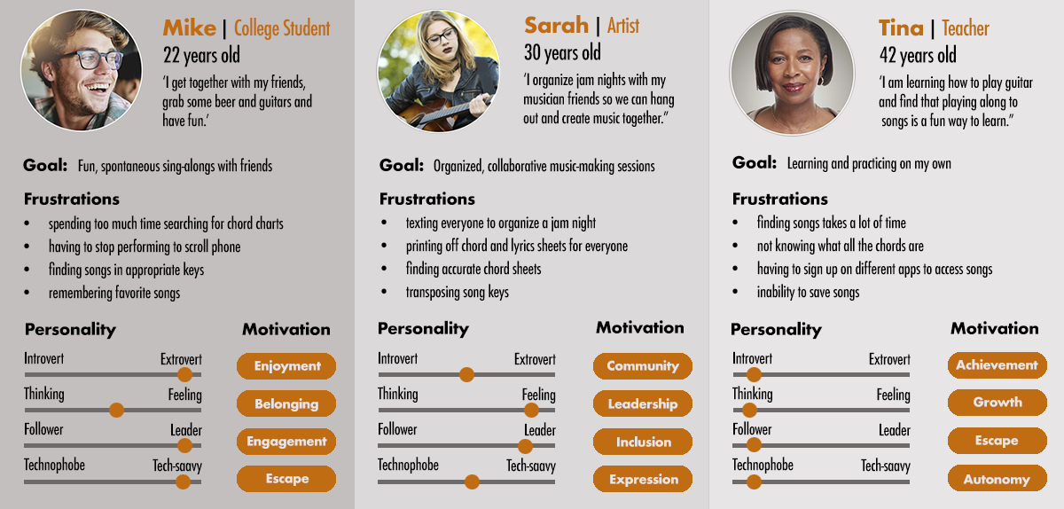
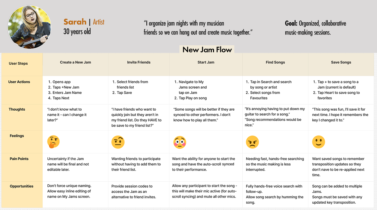
Personas
User Journey Map

AI in the Research Process
AI was used as an augmentation tool to accelerate synthesis, explore alternatives, and validate assumptions - while all design decisions remained human-led.
Research Support
- Assisted with clustering interview notes during affinity mapping.
- Generated potential edge-case scenarios (e.g., late joiners, dropped sessions).
Designer Judgement
- All themes were reviewed and validated against raw notes and observations.
- Final insights were grounded in observed behavior, not AI output.

Design
Design Principles
Design for the campfire, not the studio!1. Protect the Flow:
Keep music-making uninterrupted.
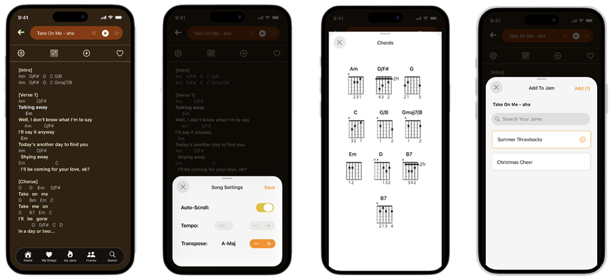
- Synchronized lyrics and chord progressions across all participants’ devices.
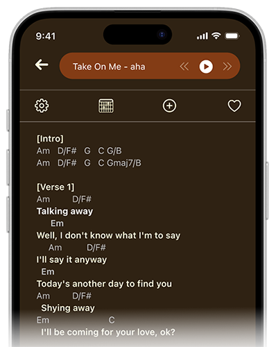
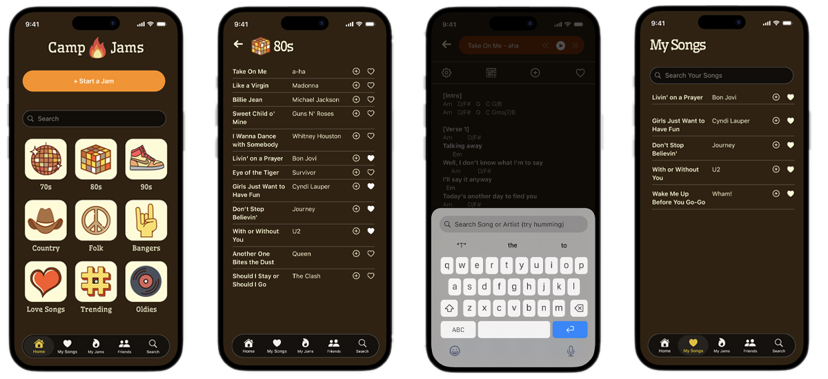
- Implemented auto-scrolling lyrics and chords to match the performer's tempo.
- Visually emphasized the current line and chord position for easy reference.
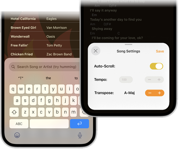
- Enabled hands-free song search and quick key transposition.
- Allowed late joiners to automatically sync to the current song position.
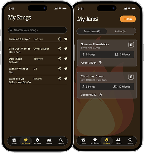
- Supported saving favorite songs and previous Jam sessions to reduce setup for future play.
✅ Result: Players stay engaged in the music rather than managing their device.
2. Enable Instant Collaboration:
Make joining a Jam effortless.
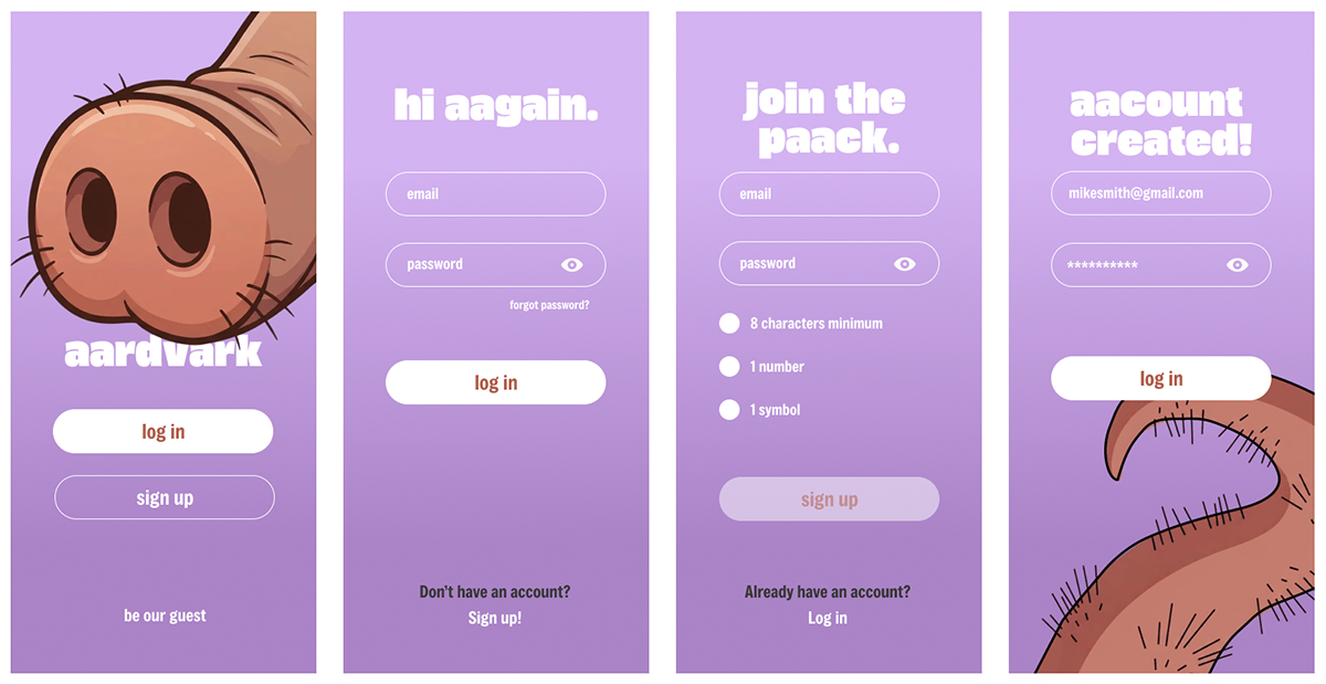
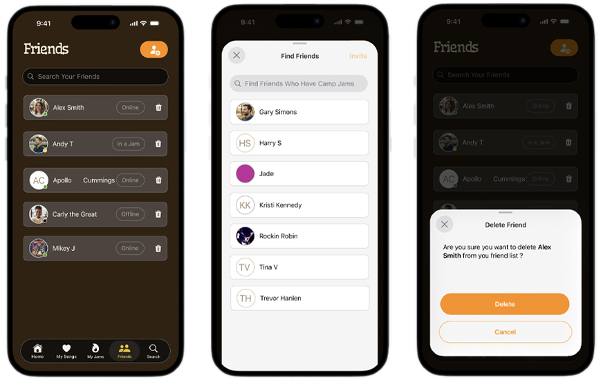
To support instant collaboration, I redesigned the entry and onboarding flow so users could join or start a Jam immediately.I identified friction points and opportunities to guide users toward their first meaningful experience, ensuring every step was clear, intuitive, and engaging.
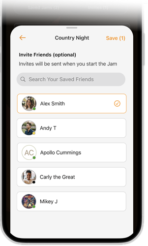
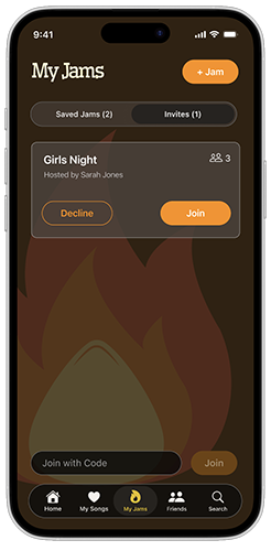
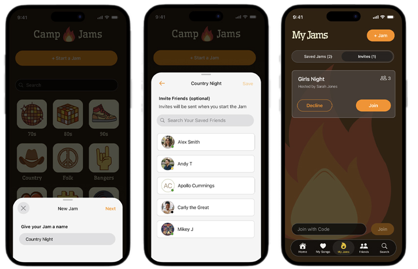
- Hosts can select participants from their friend list, who can join once the Jam starts.
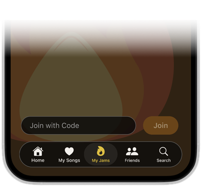
- Participants can join via short session codes for immediate access.
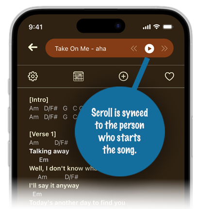
- Any participant can lead a song, with lyrics and chords automatically synced to them.
✅ Result: Participants can join instantly, whether through a session code or friends, with no setup or waiting.
Wireframes
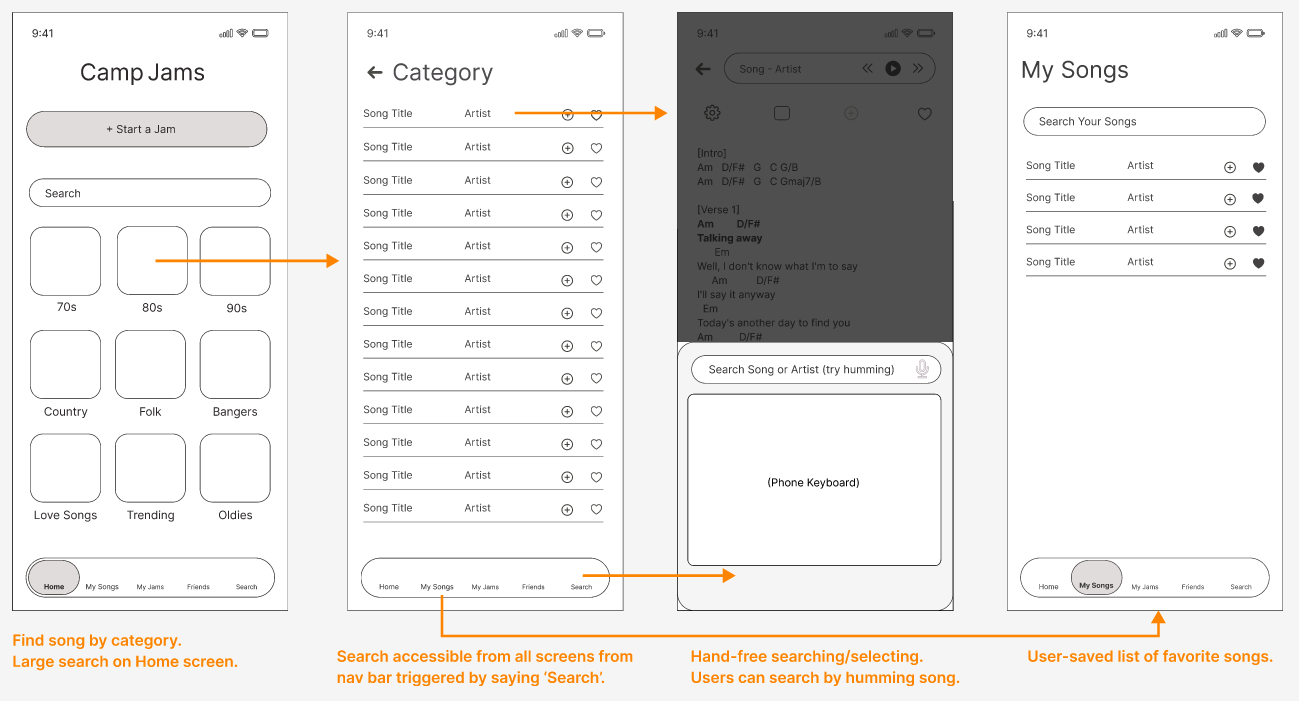
Low-fidelity wireframes were used to validate information architecture, core flows, reduce friction, and align the team on interaction patterns before investing in visual design.Key flows explored and validated:
- Jam creation and participant entry (invites + session codes).
- Song discovery and selection.
- Active Jam experience (auto-scrolling, lyric highlighting, saving to Jams).
- Friend and participant management.
Wireframes helped uncover
- Ways to reduce steps required to start or join a Jam.
- Hands-free interactions that supported uninterrupted performance.
- Edge cases such as late joiners and host handoff during a session.
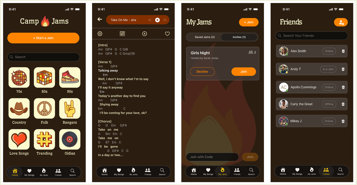
Song Discovery and Selection Flow
High-Fidelity Designs
Search Flow
New Jam-Invite Flow
Song Flow
Friend Management Flow
AI in the Design Process
Real user testing determined final design changes
Design Support
- Rapidly explored multiple navigation and Jam-creation flow variations.
Designer Judgment
- Concepts were evaluated against research-derived principles.
- Final IA and flows were refined manually.
- Reviewed wireframes for accessibility considerations.
- Flagged potential cognitive load issues during live play.

Usability Testing
Methods: Moderated, task-based testing
Key Findings and Design Impact
- Invites sent too early → Moved invites to trigger only when a Jam starts.
- Friction joining sessions → Introduced short session codes for quick entry.
- Hands-free needs during song search → Enabled song selection via voice commands from search results.

Design Learnings
Designing for live music required prioritizing emotional flow over granular control. Removing options during active Jams consistently produced clearer, more confident group experiences.
back to top